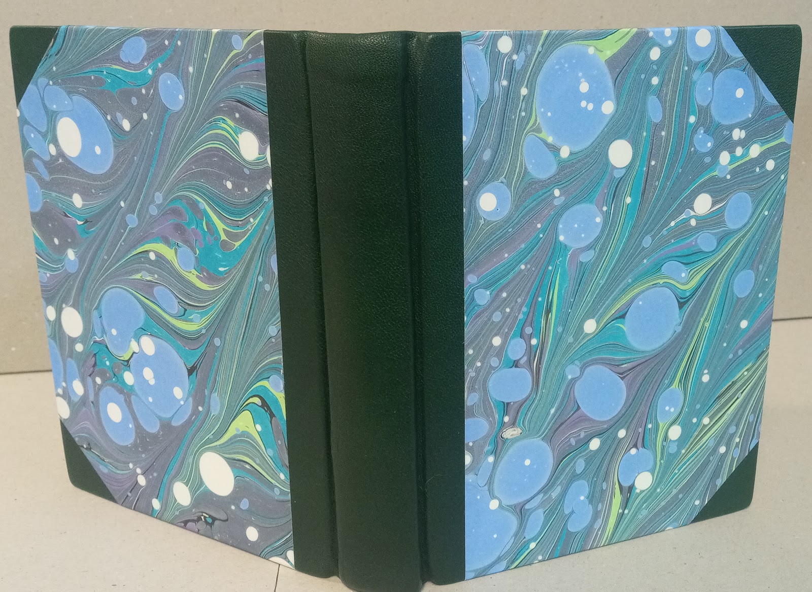
There are two books in this exhibit that I bound. One is my copy of Lock's Bookbinding Materials and Techniques 1700-1920 which is bound using a split board library binding in quarter leather. It also features my original marbling on the covers, as well as matching marbling on the edges of the textblock.

The second book bound by me is the NSBAG community art journal that was created in October 2023 during Halifax's annual Nocturne art-at-night festival. The public was invited to create the pages for this book following the prompt, "What is your favorite thing?" As the pages were finished, they were bound together into this book so the content and structure of the book were created concurrently. This is a photo of the book as it was being sewn during the event and then the finished book.

The finished book is currently on display at Hermes Gallery and members of the public are free to flip through the pages and see the artwork that was created by members of the community or find the work that they contributed at the event! There is more info about this project on the NSBAG website.
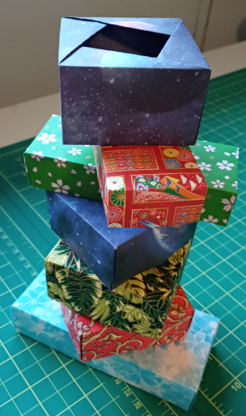
In conjunction with this show and on behalf of NSBAG, I conducted a little bookbinding workshop at the gallery last weekend. In this workshop, everyone bound their own miniature copy of The Raven. I created the textblock specifically for this workshop, formatting the text and preparing the colophon beforehand, so everyone had a tiny textblock ready to go at the beginning of the session. At the end of the workshop, we had produced this little edition of tiny books!

There are a few more photos of these miniature books on the NSBAG website.
The "Book Club" show also features a fabulous collection of letterpress posters made by Amos Paul Kennedy. They look amazing all displayed together like this.

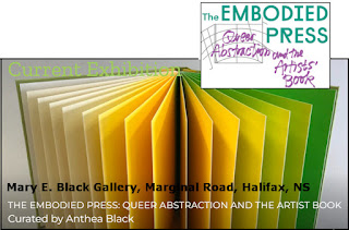
There are also many other items to see at this show including art books, sulptural works, text-themed photography, prints, tiny text, a tunnel book, and a variety of printed matter. Well worth a visit! The exhibit continues until April 21, 2023. More info available on the Hermes Gallery website.


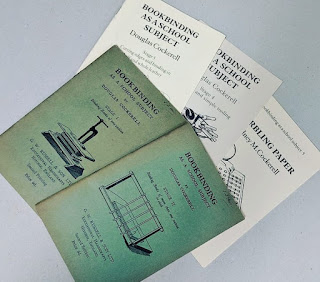 Recently I had an opportunity to see a collection of fine bindings made by Douglas Cockerell. Cockerell is well-known to students of bookbinding.
He is the author of the enduring instructional book, Bookbinding and the Care of Books, first published in 1901 and still used by many today. Also these small booklets, "Bookbinding as a School Subject" that he wrote. These are my own copies shown here. In this photo, books one and two are from the second printing; books three, four, and five are from the third printing.
Recently I had an opportunity to see a collection of fine bindings made by Douglas Cockerell. Cockerell is well-known to students of bookbinding.
He is the author of the enduring instructional book, Bookbinding and the Care of Books, first published in 1901 and still used by many today. Also these small booklets, "Bookbinding as a School Subject" that he wrote. These are my own copies shown here. In this photo, books one and two are from the second printing; books three, four, and five are from the third printing.